The Dots Are Not Harmless
AI’s friendly visual language shapes how much authority people give a system. As AI moves from generating content to taking action, the interface belongs in the governance model.

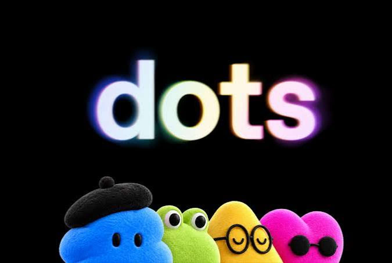
AI has developed a visual language of its own: soft gradients, sparkles, orbs, friendly characters, conversational names and dots that pulse while something is “thinking.” The effect is intentional. Complex technology is made to feel simple, approachable and familiar.
I noticed this firsthand. I had been experimenting with dots in Eudai’s own branding. Over the weekend, before OpenAI launched dots this week, intuition told me to make some changes.
This piece is my attempt to explain what that instinct was picking up on.
That is usually treated as a product or marketing decision. Increasingly, it should also be treated as a governance decision.
Design affects how people interpret technology. A system that looks friendly can feel less risky. A conversational response can sound more like judgment than generated output. A polished assistant persona can imply understanding, discretion or authority that the underlying system does not actually possess.
This is sometimes described as anthropomorphic design, where technology is given human-like characteristics, or affective design, where visual and interaction choices are used to shape emotional response. Neither is inherently problematic. The issue is what happens when those choices influence how much authority, confidence or trust a user gives the system.

A system can feel reassuring while being wrong. It can feel thoughtful while producing a probabilistic answer. It can feel personal while operating at enormous scale. And it can feel harmless while participating in decisions with financial, operational or human consequences.

Trust can be designed
For years, one of the challenges with AI was getting people comfortable enough to use it. We may now be reaching the opposite problem: interfaces have become very good at making powerful systems feel ordinary.

That matters because trust does not come only from accuracy, evidence or experience. It is also shaped by presentation.
Take the same recommendation and put it in two different contexts. In one, it appears as a row in a spreadsheet. In the other, an AI assistant says, “I’d recommend proceeding.” The information might be identical, but the perceived authority is not.
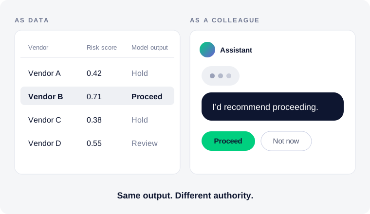
That difference becomes much more important as AI moves beyond generating content and into recommending actions, executing workflows and acting through agents. A friendly interface attached to a writing tool is one thing. The same design language wrapped around a system that can move money, alter customer records, approve claims or change infrastructure is something else.
The dots stayed cute. The consequences changed.
This belongs in the governance model
Most AI governance frameworks rightly focus on models, data, privacy, security, bias, explainability and accountability. But organizations should also be looking at how the product experience shapes human behavior around the system.
That means asking practical questions about the interface itself. How is uncertainty communicated? Does the system distinguish clearly between generating an answer and making a recommendation? When is human confirmation required? Does the language imply more confidence than the model can justify? Does the design encourage users to think of the system as an authority or colleague? Are people more likely to disclose sensitive information because the interaction feels conversational?
These can sound like UX questions, but they are also questions about human oversight.
The same applies to how autonomy is presented. If a system can take action, users should be able to tell when it is suggesting, when it is deciding and when it is doing. Those distinctions should not be buried behind the same friendly interface.
Proportionality matters
The answer is not to make every AI product look intimidating or cover every screen in warning labels. Good design still matters, and people still need to be able to use the technology.
The better principle is proportionality.
As capability and consequence increase, the cues surrounding the technology should become more deliberate. A system helping someone brainstorm a birthday invitation can reasonably behave differently from an agent making changes inside a financial institution.
The experience should help people understand that difference.
Governance therefore cannot stop at what an AI system can do. It also needs to consider what the product encourages people to believe it can do, how much authority users are likely to give it and how easily the interface might blur the line between assistance and agency.
The interface is part of the control environment
We often think of governance as something that sits around technology: policies, committees, controls and approval processes. Increasingly, some of the most important governance will live inside the experience itself.
It will show up in how uncertainty is displayed, where approval is required, how recommendations are worded and whether autonomous action looks meaningfully different from generated output.
Even in the dots.
Because the interface is not simply decorating the technology. It is teaching people how to interpret it.
And as AI systems become more capable, that deserves much more attention.
Part of our work on AI governance marketing.